What makes a great SaaS website in 2022? It’s hard to keep up given design trends change quicker than you think. This makes predicting what might come next and stick around more challenging.
You’re probably curious about what design trends we’ll see in this upcoming year to optimize your user experience and user interface. In hopes to help out, we’ve gathered 5 different trends (with examples!) of emerging design trends that’ll make an impact on your website this year.
1. Mobile design first, responsive design
Did you know 51% of the population currently accessing the internet using their mobile devices? Well, that number is expected to be 72.6% by 2025, that’s almost three-quarters of the population. That being said, if you aren’t considering mobile design first you might be in trouble. It’s an important strategy to incorporate into your product, website and whatever else design.
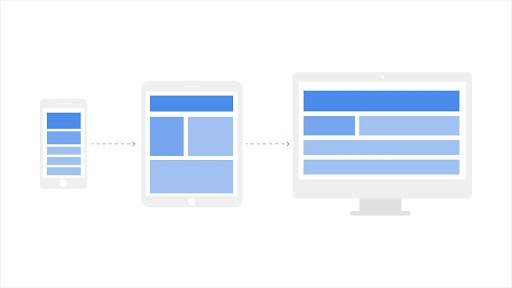
So let’s talk about mobile-first design. What is it? It’s a design philosophy that you start your design process on the smallest screen possible, typically a mobile device. Mobile-first design is often content-first as well. Mobile has the most limitations, screen size, and bandwidth to name a few, and so designing within these parameters forces you to prioritize your content.
This organically causes the design to be more content-driven, therefore user-focused. Another benefit to mobile-first designing is that it creates a seamless transition when you begin to design on different screen sizes. Once you are able to expand onto larger screens, you are aware of what must be made most prominent: the content on the mobile screen.
Still not convinced? Well, Google is always looking for ways to rank user experience when it comes to websites using real user behavior and data. And they upgraded in 2019. They now use mobile-first indexing, but what is that? Well, mobile-first indexing means Google predominantly uses the mobile version of the content for indexing and ranking. Hopefully, that was enough to convince you!
 2. Micro-interactions
Now, these may sound small and even unimportant, but micro-interactions play a huge role in how we experience a site. So what is it? A micro-interaction is simply an interaction between the design and the user. If done well, they enhance a user’s experience with the design and make it more memorable. It’s one of those things that you don’t notice until it’s no longer there.
For example, you know when you hover over a CTA and the color changes? Ya, that’s a micro-interaction. Or maybe your loading time is a little longer than you want it to be so you add in an animated countdown. It’s as simple as letting the user feel what they are doing and getting instant feedback on their interaction with the site.
Letting the user feel like they are in control heavily affects their overall experience. Try to incorporate micro-interactions all throughout your site to really make the user experience one to remember.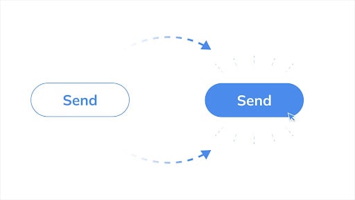
3. Chatbots
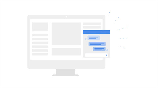
You’ve probably already had an experience with a chatbot, we see them everywhere. Now before you recall that bad experience you’ve had with a chatbot, hear me out. A majority of our decision-making is made prior to engaging with a sales representative. In fact, according to a report by Forrester, 68% of B2B customers prefer to research independently online.
Long story short, you should probably recognize the power of online presence. Besides being able to provide 24/7 support, a chatbot will likely be able to talk in a more “human” way and make customers feel more connected directly to a company.
In terms of B2B, a chatbot is there to improve a prospect’s journey throughout the website and make them feel cared for. Establishing that the company cares about the prospect’s comfort is vital. When you care about the client’s satisfaction and success it facilitates a more long-term relationship.
Looking for a free and easy way to upgrade your website? Check out Amy, an intuitive chatbot with pre-made, customizable templates made just for your small business. It’s super easy to sign up and plug into your already existing website and did I mention it was free?
 4. Intuitive navigation bar
B2B SaaS companies tend to have over a dozen pages on their website. How do you assign value to each of those pages and determine which should be included on the main navigation menu? Before we get into that, let’s discuss what makes an intuitive navigation menu.
An intuitive menu will navigate your prospect through the website seamlessly from web page to web page while also allowing them to consume the information they want and bypass the information they do not want. It simply comes down to the overall user experience you provide.
To begin, just because the main navigation might provide enough room for all the web pages through the use of drop-down options, doesn’t mean you should put everything up there. A general rule of thumb is to only include 5-7 headers in the menu. Then, create categories based on those headers using dropdown menus.
5. Bold typography & intentional animations
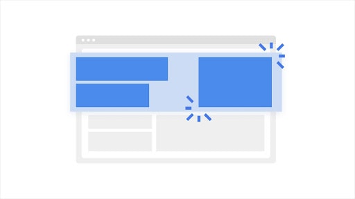
A portion of a website’s role is to make an impression and what better way to do that than with bold typography and intentional animations. The year of 2022 is going to feature bright, bold typography, especially in the hero section.
We’re starting to see the hero section become more about the messaging and typographically-led rather than the image. It’s typically the first impression, so why not go bold? Going bold through simplicity clearly communicates a message while also making an impact.
Yeah, typography is cool but let’s not forget about the imagery. Still images are starting to get repetitive and familiar. Let’s queue the animations. Simple animations bring life to the website and make more complex information easier to understand and digest.
But there is such a thing as throwing an animation on a site just because. All animations should have an intention so you don’t overwhelm the user with visual information. The successful usage of animation comes with balance. It shouldn’t be too distracting from the text but should also enhance the user experience with the site.
In terms of file type, I recommend using lottie files. They’re a lightweight, scalable option for your webpage. So not only can it include a cool, intentional animation but it shouldn’t disrupt your loading time, which you can learn all about in this blog on website design.
Designing your website in 2022
Let’s wrap this up. With design trends constantly changing, it’s hard to keep up. As long as your site includes some of the trends listed in this blog you should be set for 2022. That being said, trends are bound to change so how might you stay up to date for new trends to come? Taking advantage of various design resources is my favorite way.
Check out sites like behance and dribbble to see some pretty cool work. Finally, keep yourself active in the design community to increase your ability to recognize and implement new trends, therefore optimizing your B2B SaaS website.

